Our design principles
Education, by design.
A closer look at the brain. A clear boundary around what the exhibit does—and what it does not.
Explore our principles
A clear purpose
More room for curiosity.
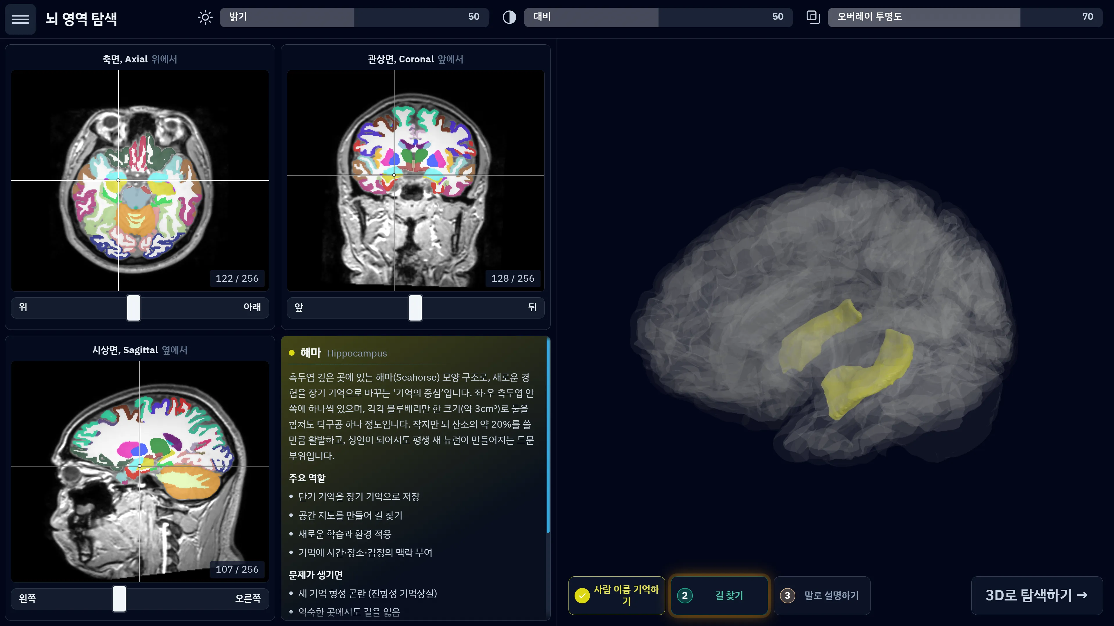
MR.Brain-Edu is made for looking, asking and discovering. Visitors explore prepared MRI-based content—not a result about their own health.
We use precomputed segmentation to connect slices, regions and spatial anatomy. We do not measure individual images or turn them into personal assessments.
Meaningful comparison
Let the differences remain.
A comparison should reveal change, not quietly remove it.
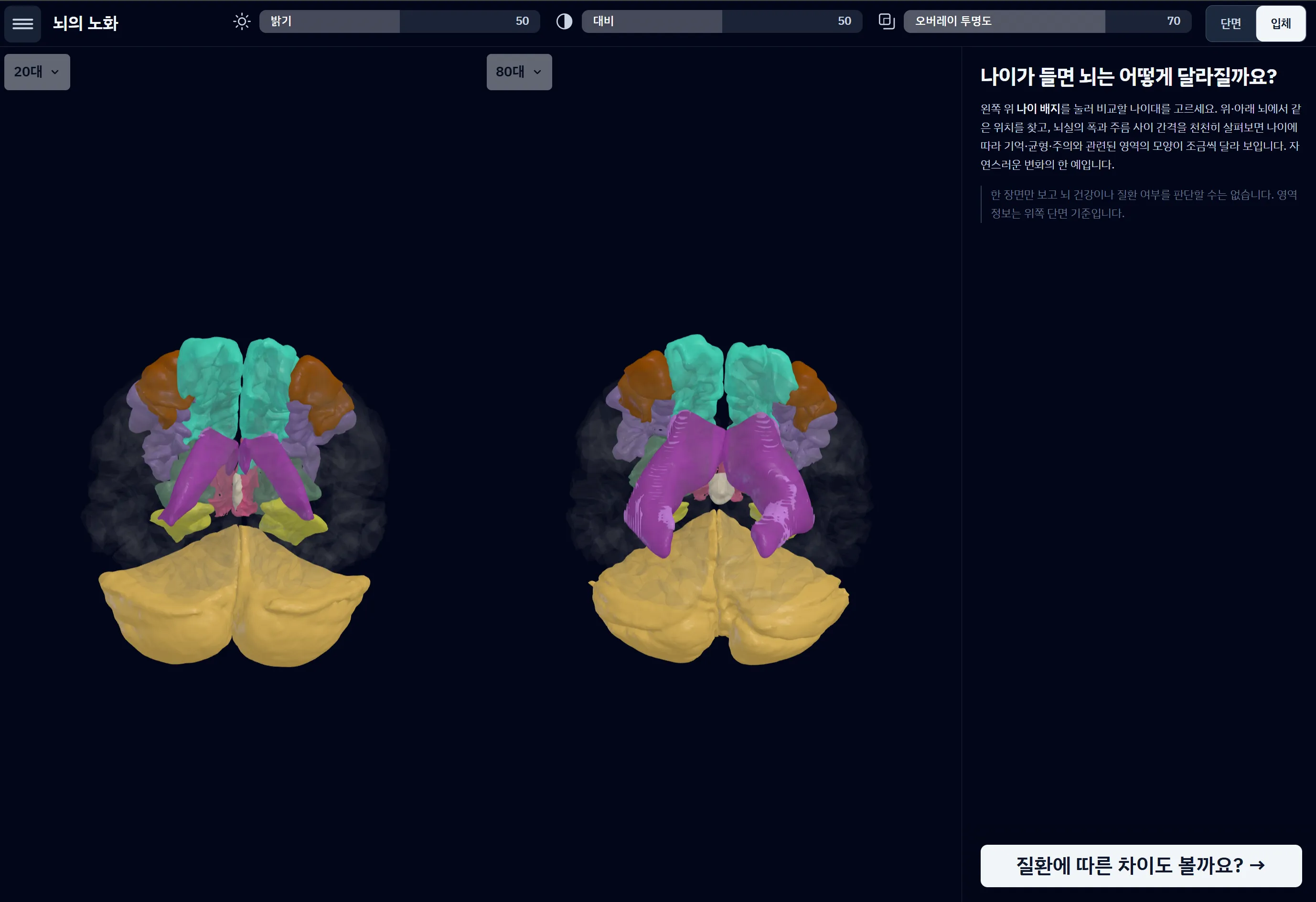
We align position using a brainstem anchor. We do not rescale or warp anatomy into a standard shape that would erase the differences visitors came to observe.
Size and form remain visible. Position is aligned through translation alone; residual head tilt is an accepted limitation.
Evidence with context
Keep the source in sight.
A reference figure belongs on screen only when published group-level evidence supports it. If the evidence table has no figure, that line stays absent.
Ageing uses the public IXI dataset. Disease comparisons use separately held data. Different sources stay separate, and comparisons stay within the same source and context.
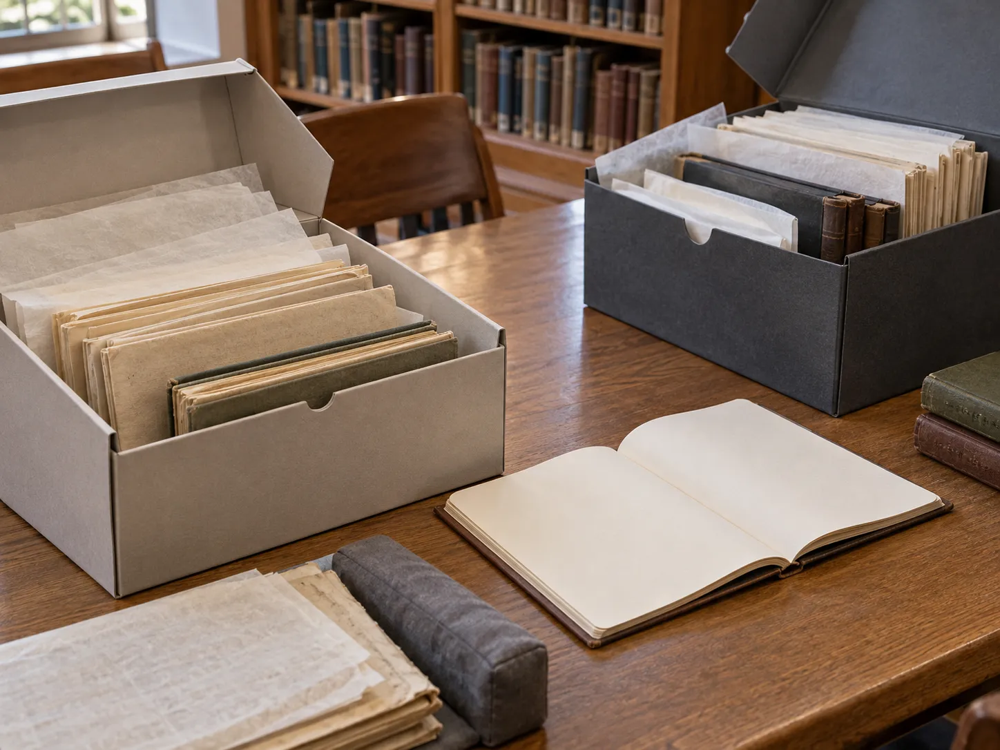
Editorial illustration of source separation; not the product’s research records.
Attention belongs to anatomy
Colour has a job to do.
Brain regions carry the colour. The interface gives them room.
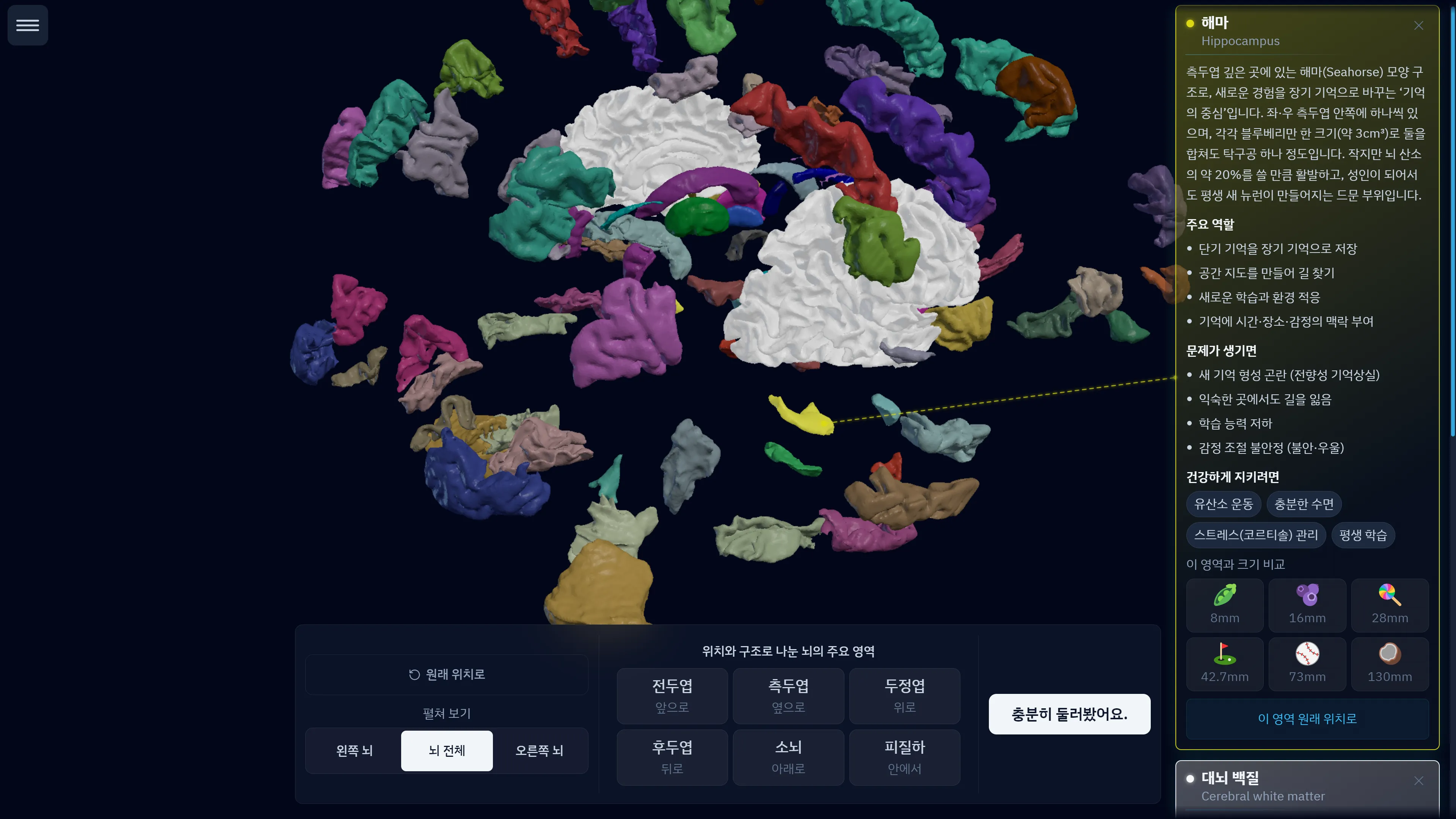
Controls stay achromatic so they do not compete with the structures a visitor is trying to find. Amber is reserved for temporary guidance.
In the application, text and symbols accompany colour wherever state matters. Understanding should not depend on colour alone.
From principles to practice
See the thinking. Explore the exhibit.
Review the product in a demonstration, or take these principles into your institution’s technical review.